


How A Brand’s Personal “Story” is Conveyed Through Design
“We believe every space tells a story.”
Emblazoned in bold across the home page, this statement encapsulates the design philosophy of JDEA Studio- that every space has a unique emphasis to highlight, and to design said space in such a way to bring it to its full potential. The bounds are limitless- from a seaside secret society to a deceptively simple subway station, every space tells their own unique story in their own unique ways.
Style
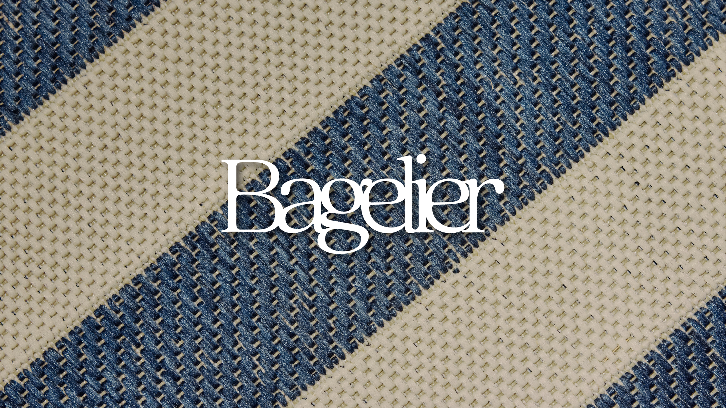
The Bagelier logo over white and blue striped burlap.
A postcard arrives in the mail.
On one side, a picturesque coastline, dotted with striped umbrellas. On the other, an address and a logo stunning in serifs. It seems you’ve been invited to partake in a clandestine gathering…
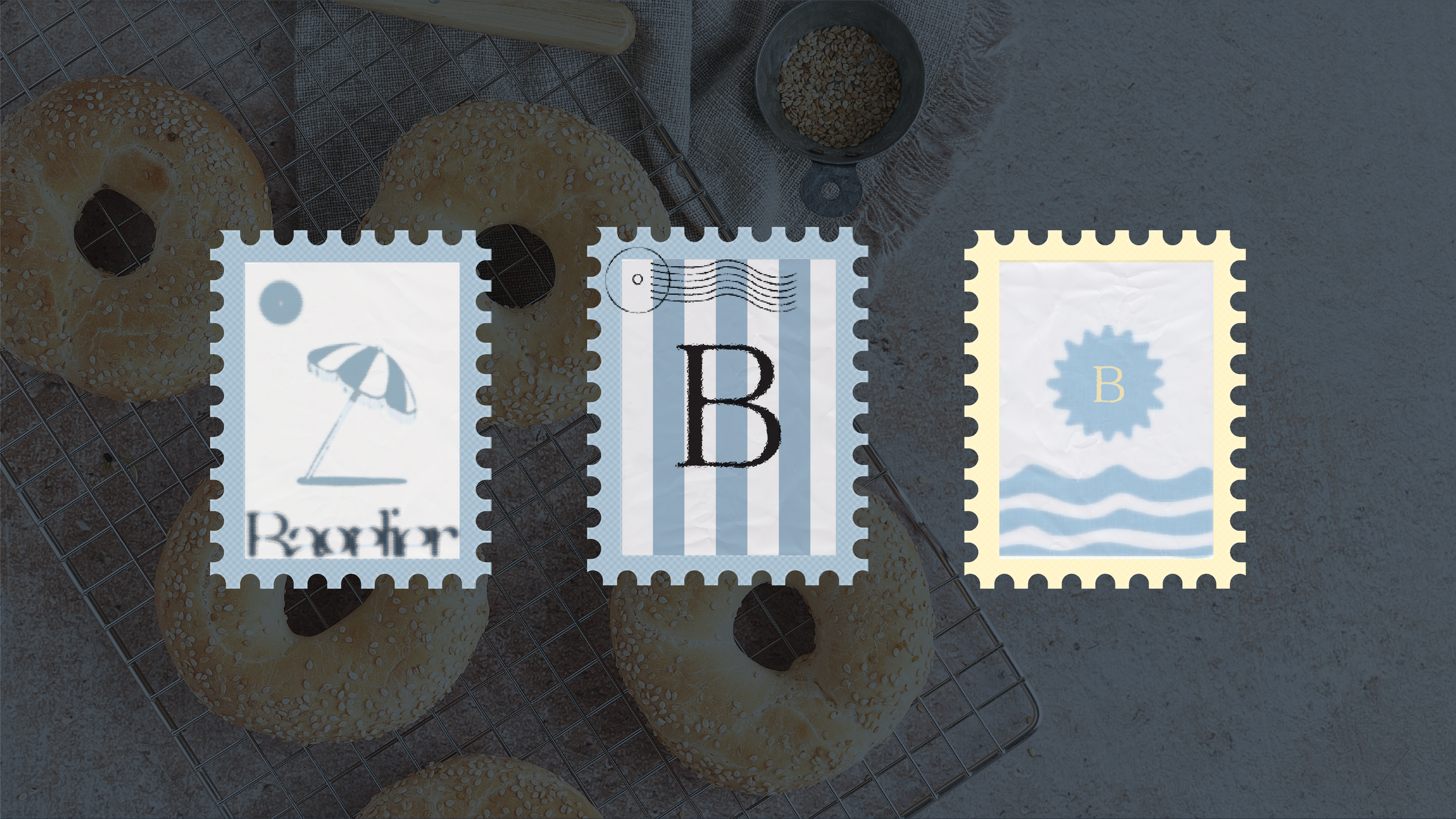
Three Bagelier-themed postage stamps on top of a picture of bagels on a cooling rack.
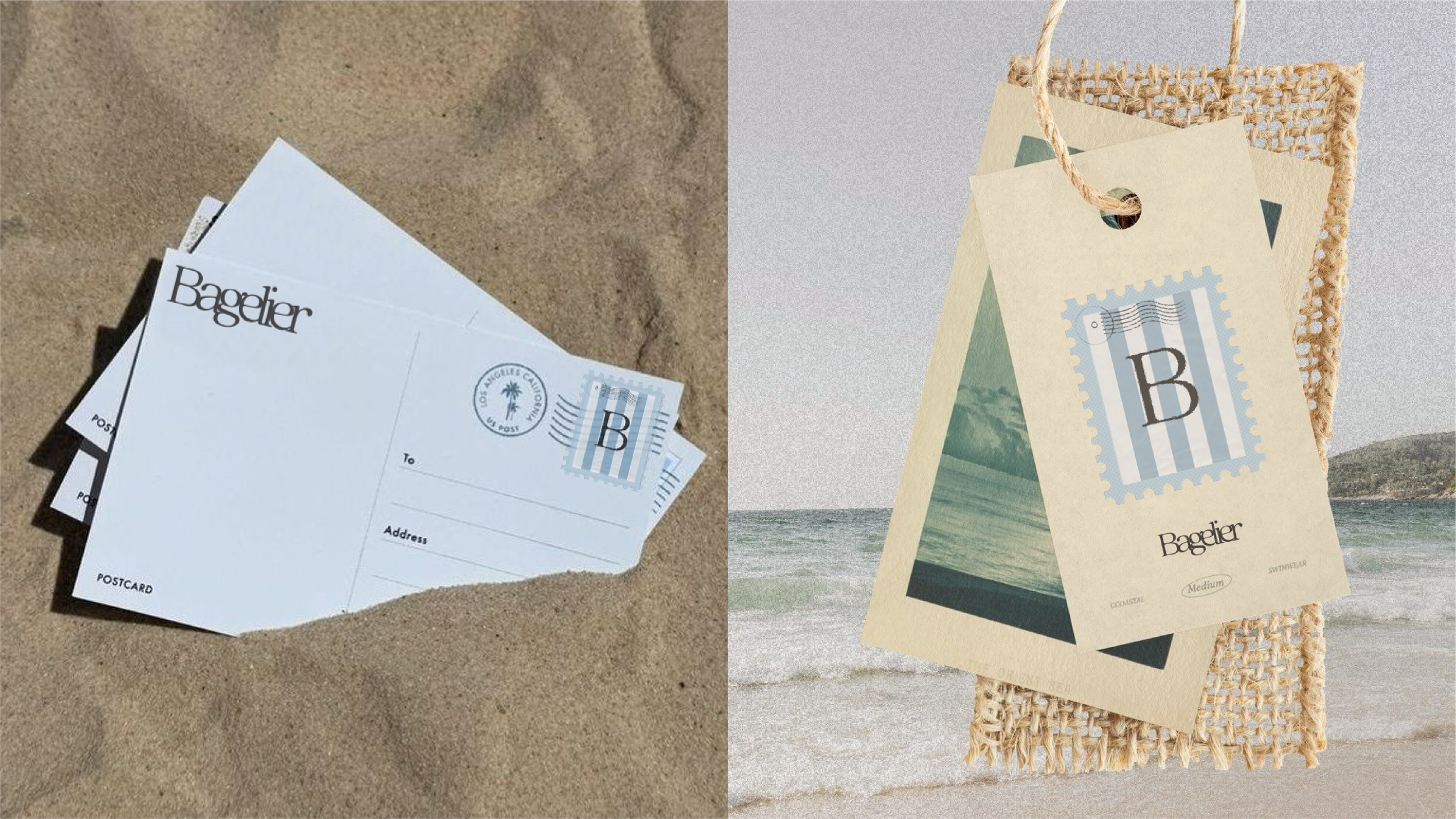
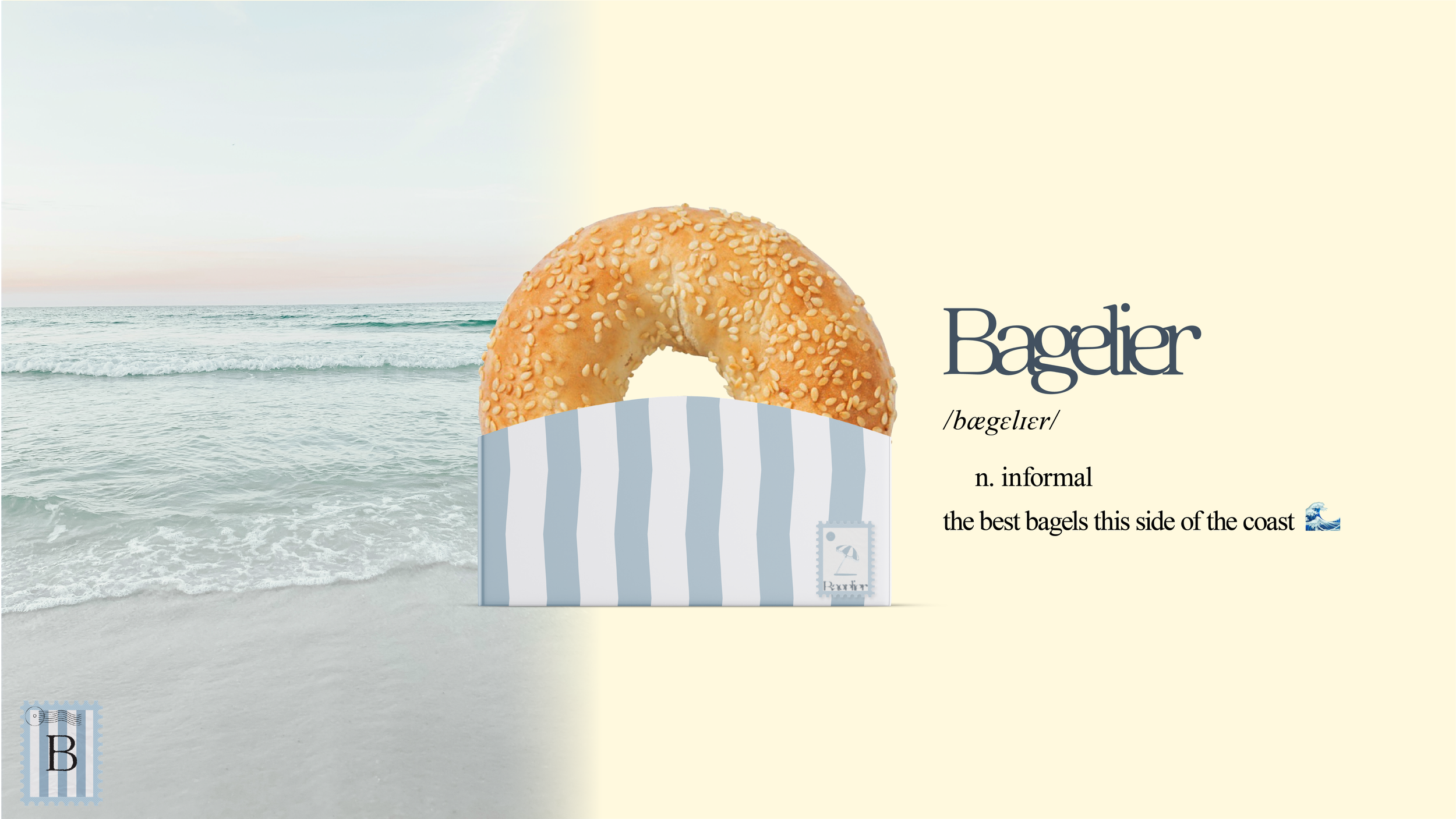

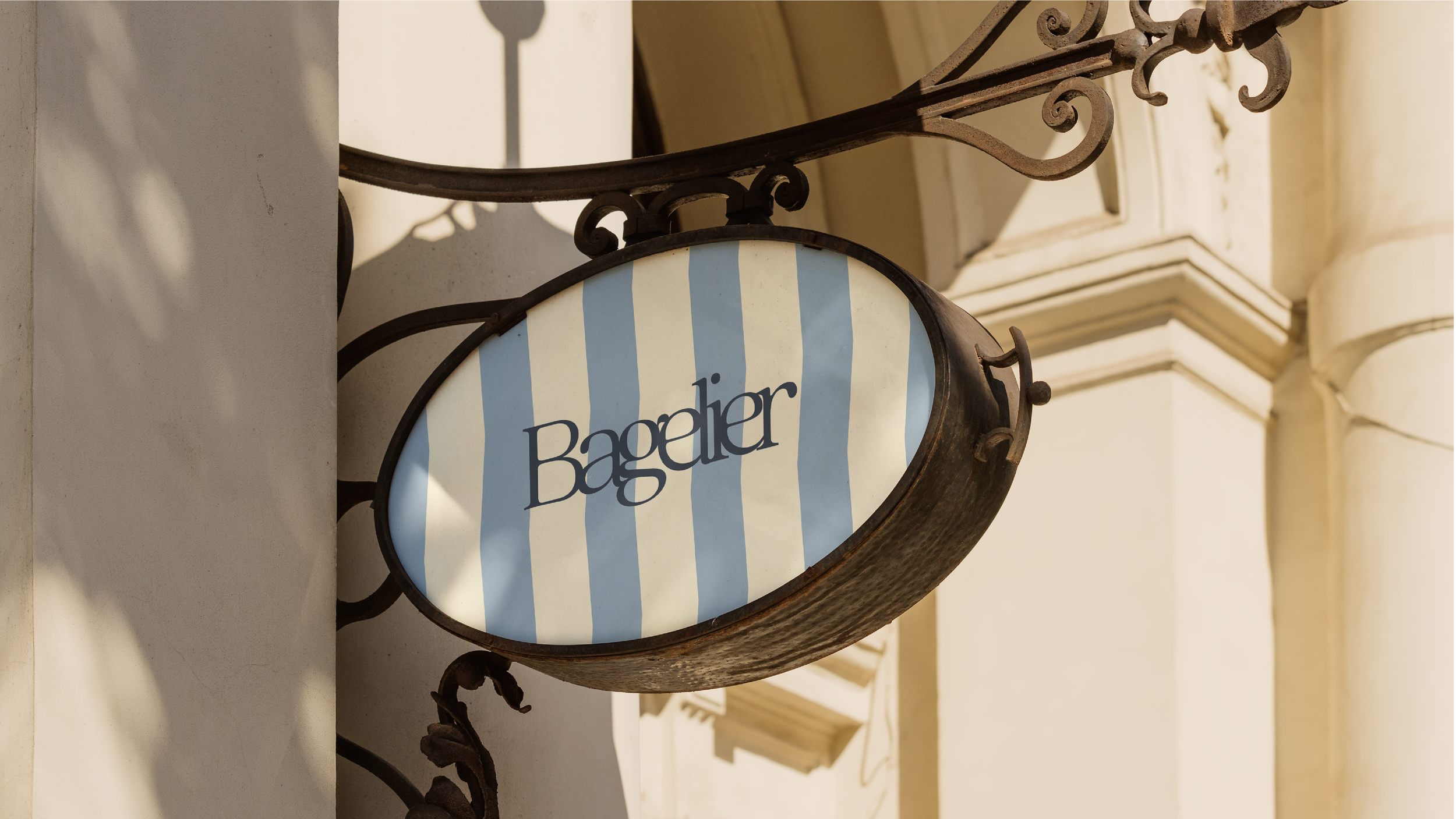
With a color scheme reminiscent of sun-faded beach paraphernalia and a bold but elegant font, Bagelier aims to bring you a glimpse into a world where a secret society of bagel connoisseurs doesn’t seem far-fetched in the slightest. Typically, all a bagel brings to mind is a rushed morning, a stiff half of a cold bagel with even colder cream cheese. Bagelier challenges this preconception with bagels that represent a moment of tranquility— a meaningful break to unwind and enjoy the gentle breeze, rather than an unsatisfying snack eaten on the way to work. Utilizing iconography nestled inside stamp frames in appealing colors and an iconic striped pattern to bring forth thoughts of rippling waves or patterned beach towels among others, Bagelier builds a narrative intended to encourage you to take a moment to breathe and enjoy a delicious bite of the seaside.
Logo

The LuxFit logo overlayed over a concrete wall. A leafy plant is casting shadows on the wall in the corner.
The doors swing open.
A luxury spa, awash in tasteful creams and golds, awaits you. You get the feeling that’s not all there is to it, though…
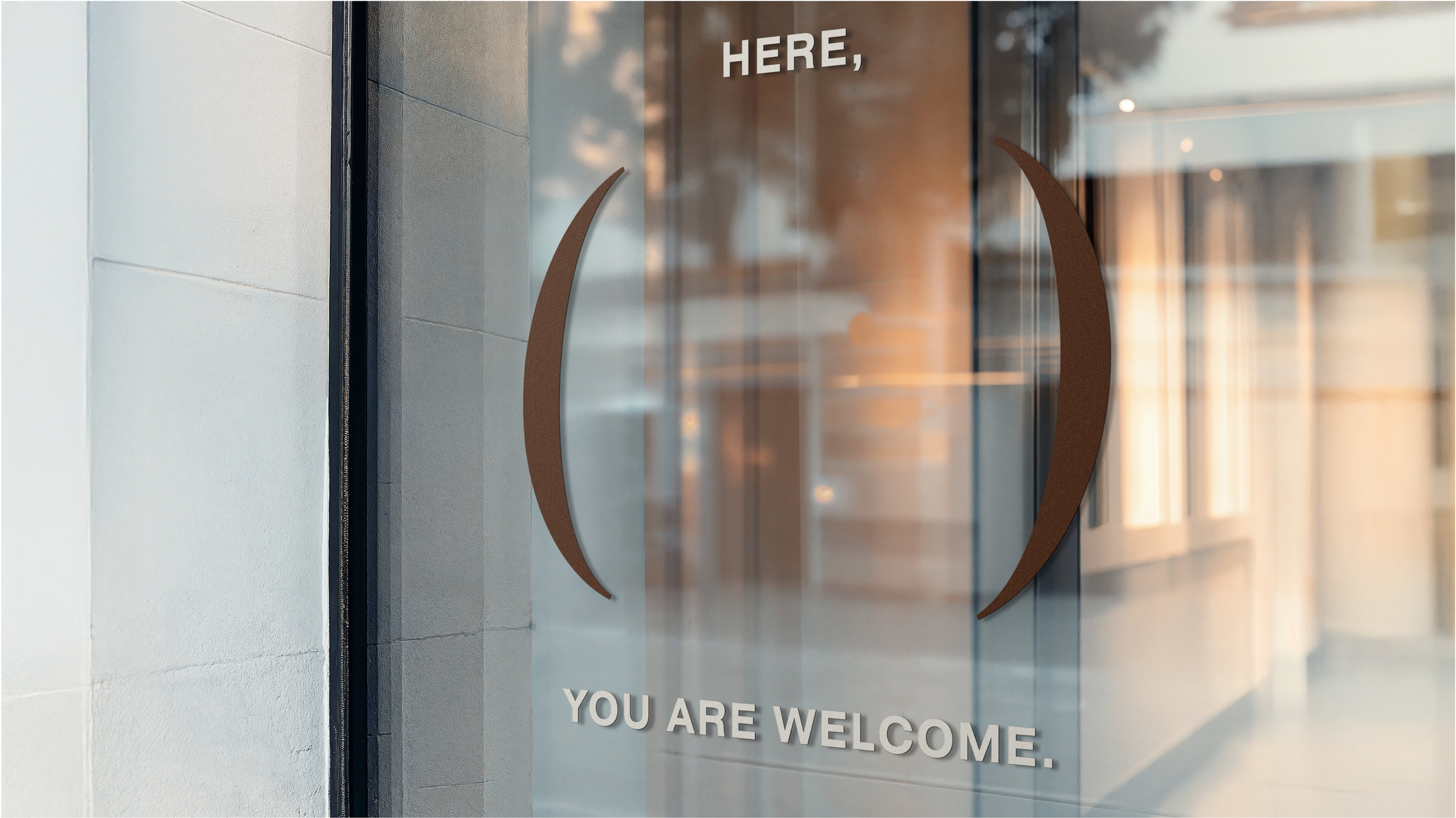
A decal on an exterior store window. Two brown parentheses form a wide, open-ended circle in the middle. Over top and bottom of the parentheses is text that reads “HERE, YOU ARE WELCOME.” in white sans serif font.
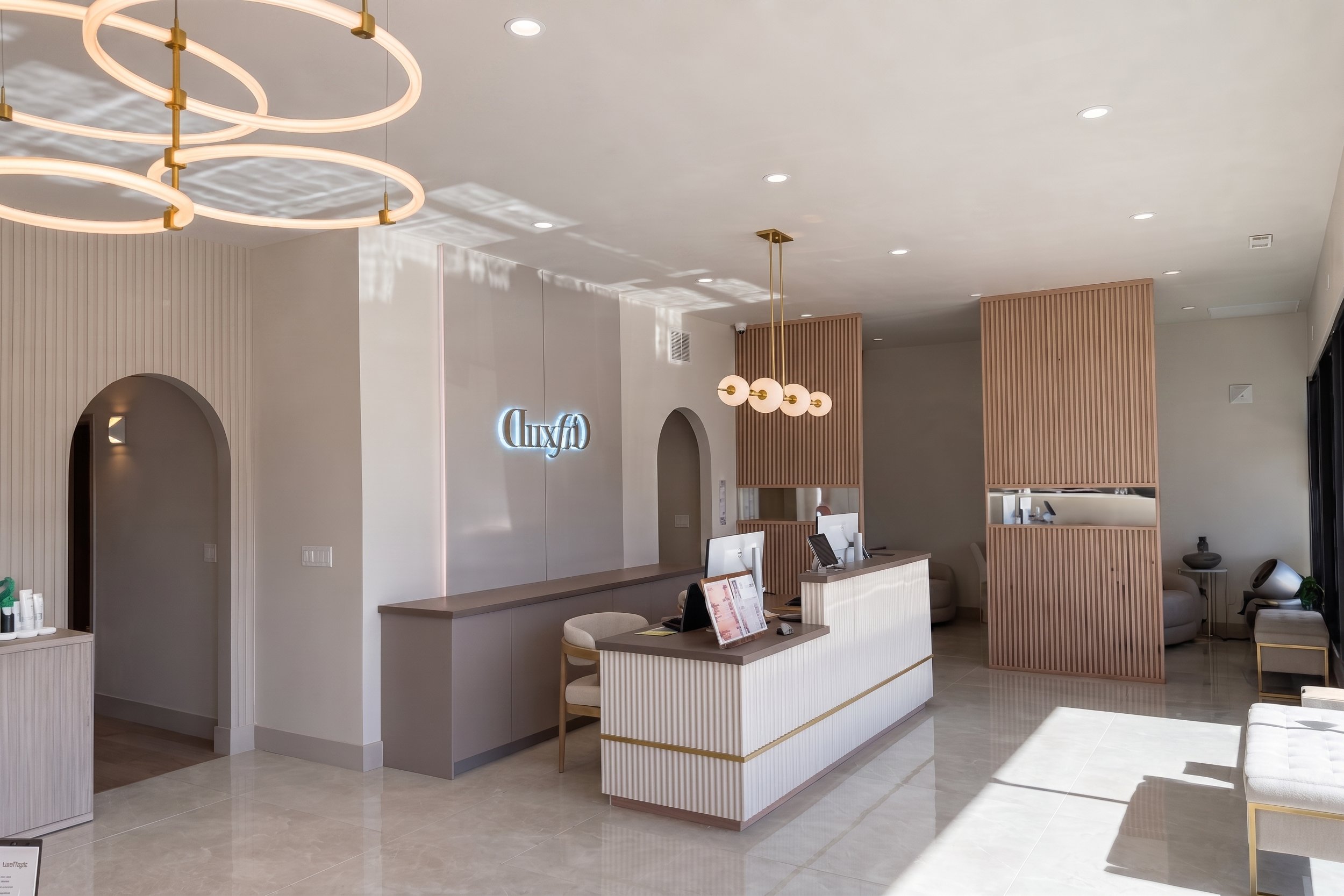
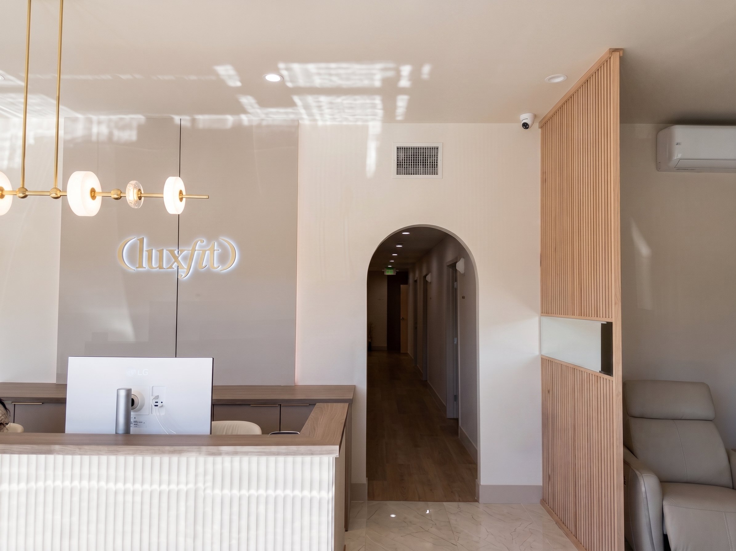
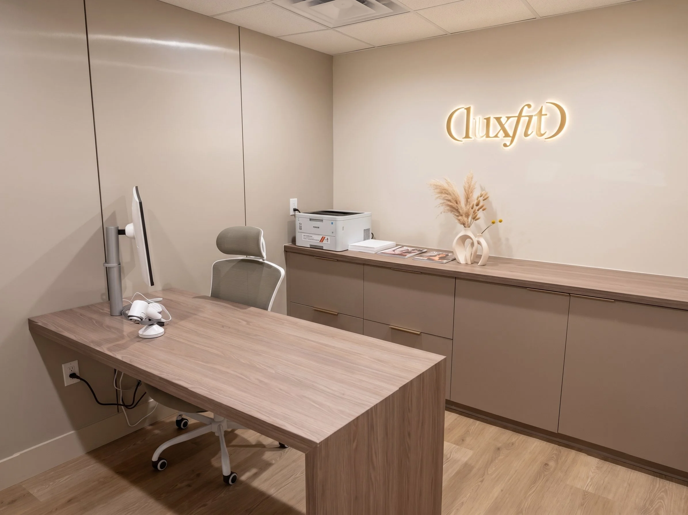
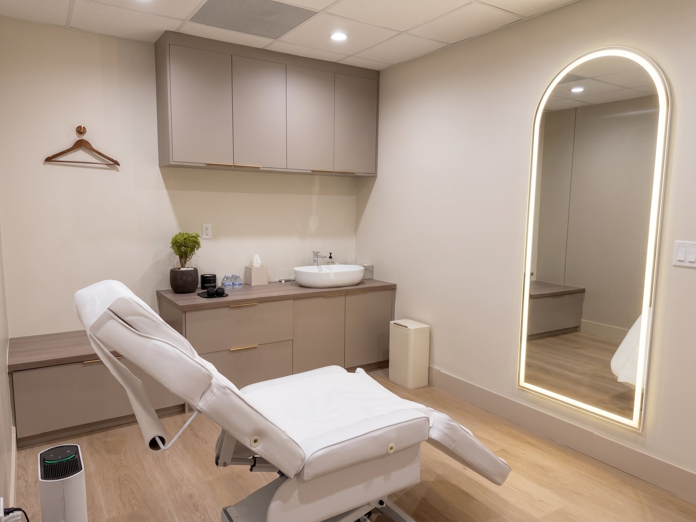
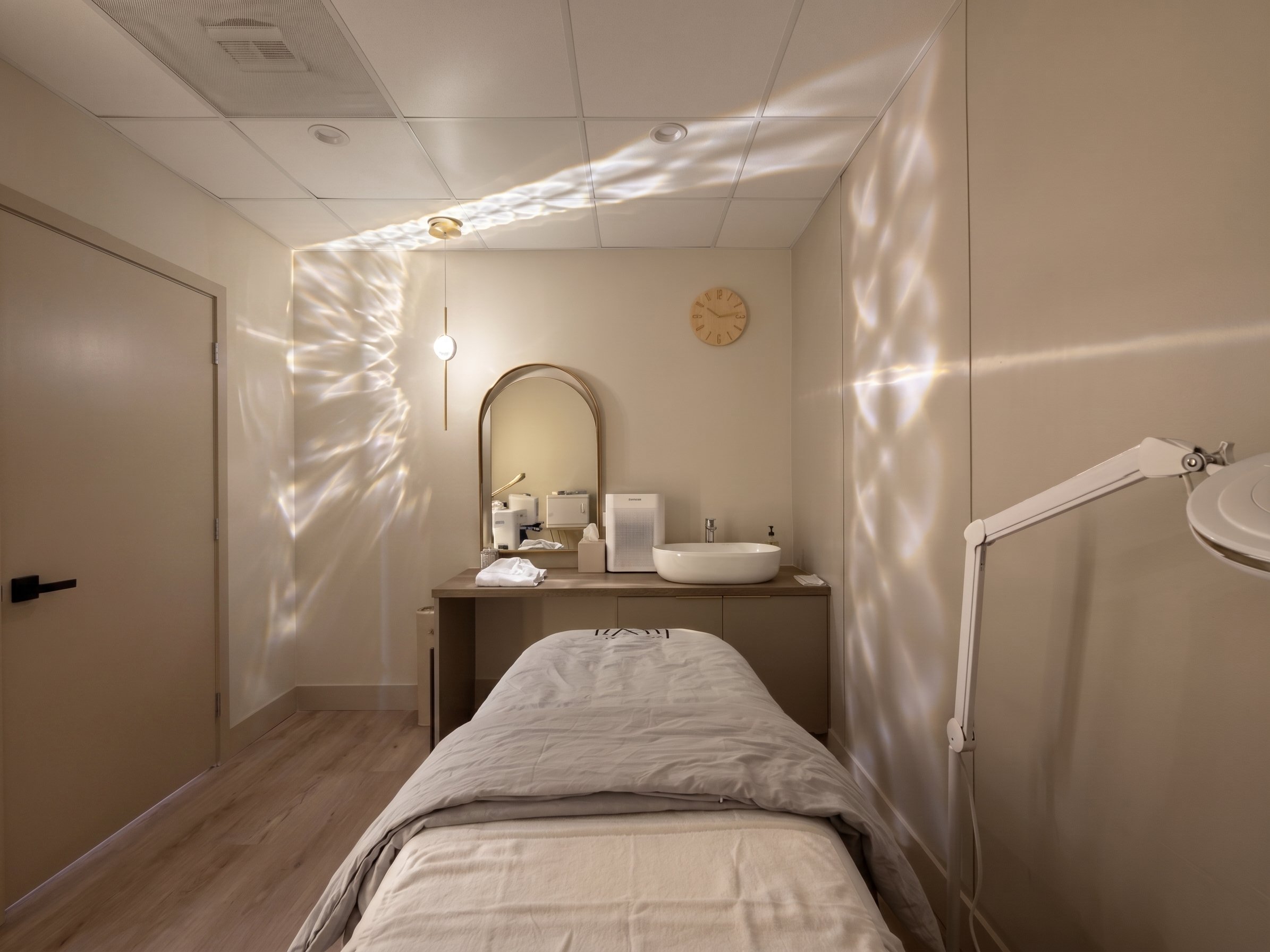
The gentle golds and browns of LuxFit’s branding unearth feelings of something beautiful in its naturalness. Compared to that, LuxFit’s logo might seem out of place, evocative of a math classroom rather than a glowing spa. On first glance, it may not seem like much— the store’s name written in elegant font, all wrapped into a nice group by the surrounding parentheses. A simple “in here, you are welcome”. A closer look, however, and you may notice its similarity to a familiar math term. The f of a function, the ever-reliable x, the parentheses gathering everything into one place. But wait, a function isn’t only defined as f(x) — something is missing. The missing variable— y— is you. LuxFit recontextualizes familiar terms of mathematics into something more personalized: you define the variables, and LuxFit takes those and outputs a personalized solution tailored to your specifications. Simple in its complexity, LuxFit tells its story in an ingenious spin on a classic subject everybody knows.
décor

The Seoul Stop logo overlayed in front of a moving train.
The bus rolls to a stop.
You’ve been on the road for a while. As you walk up a set of stairs, suddenly you find yourself walking… underground? White tile, glossy stone floors, bright stripes of color streaking across the walls— you follow the arrows and see where they lead.
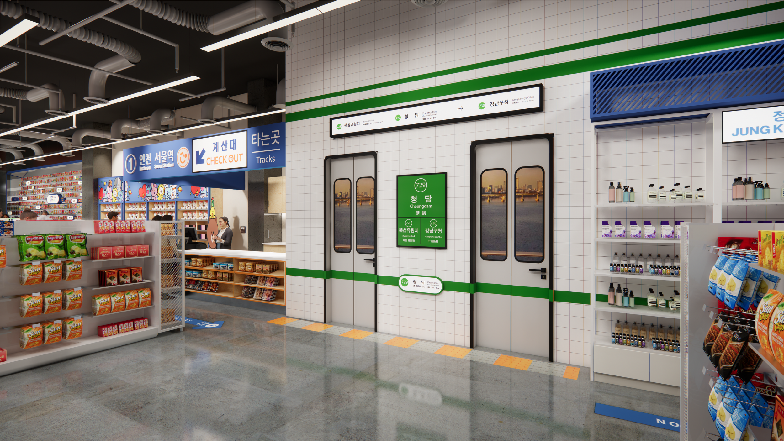
An interior shot of a Seoul Stop mockup. The focal point are the faux subway doors on the wall.
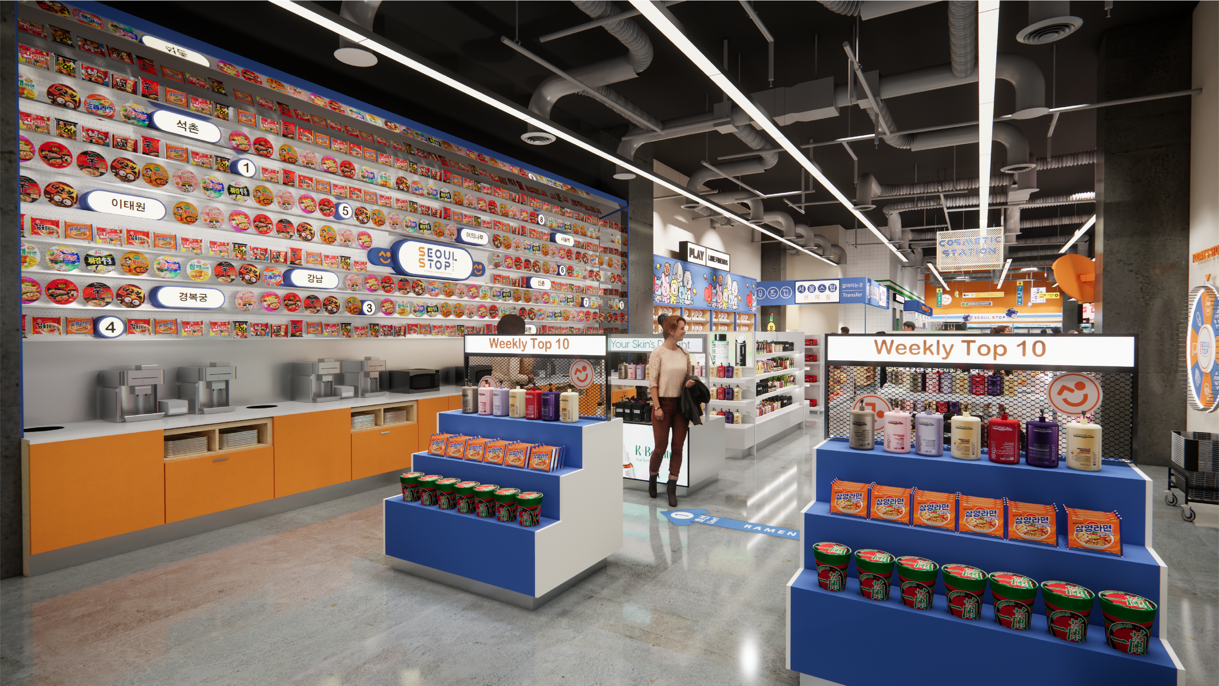
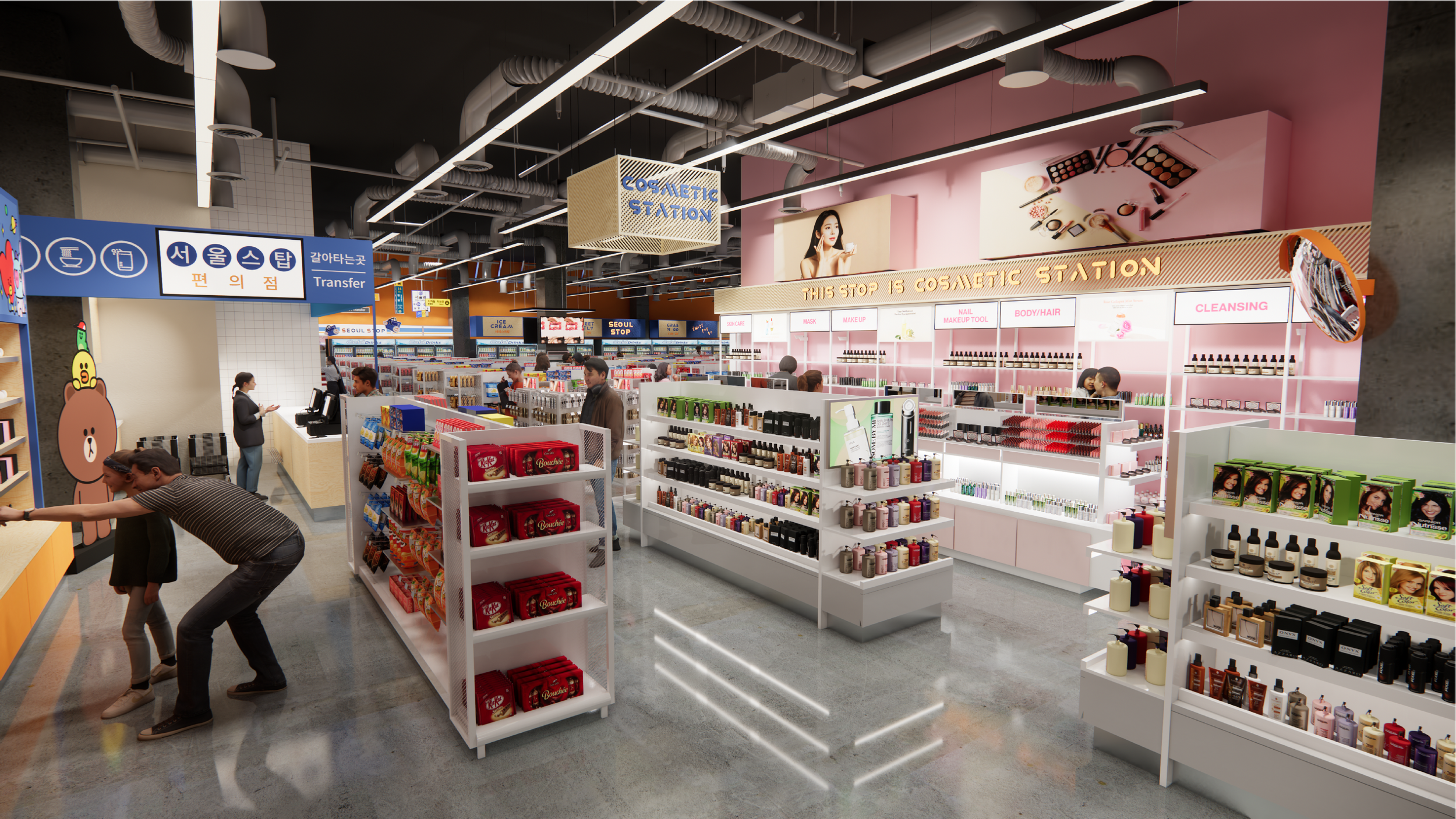
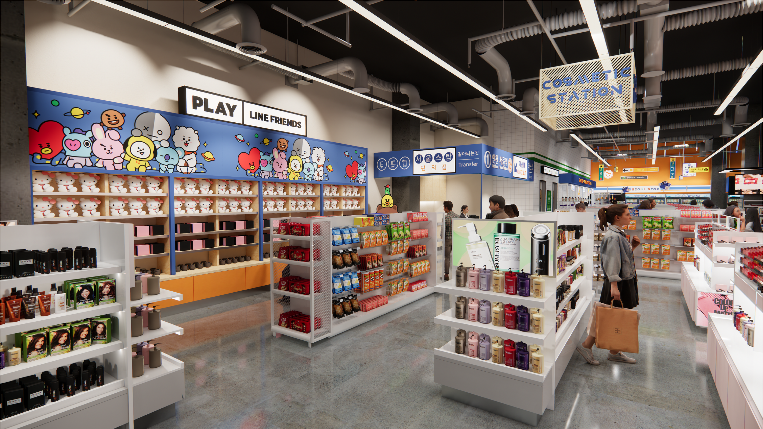
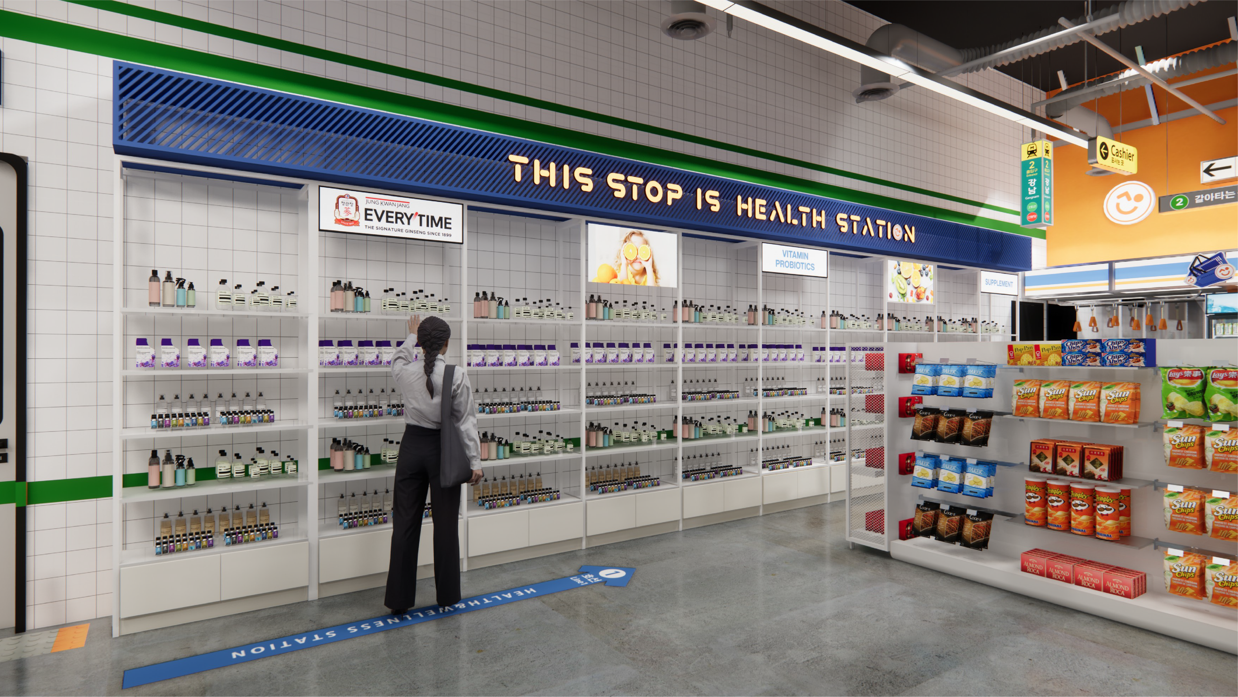
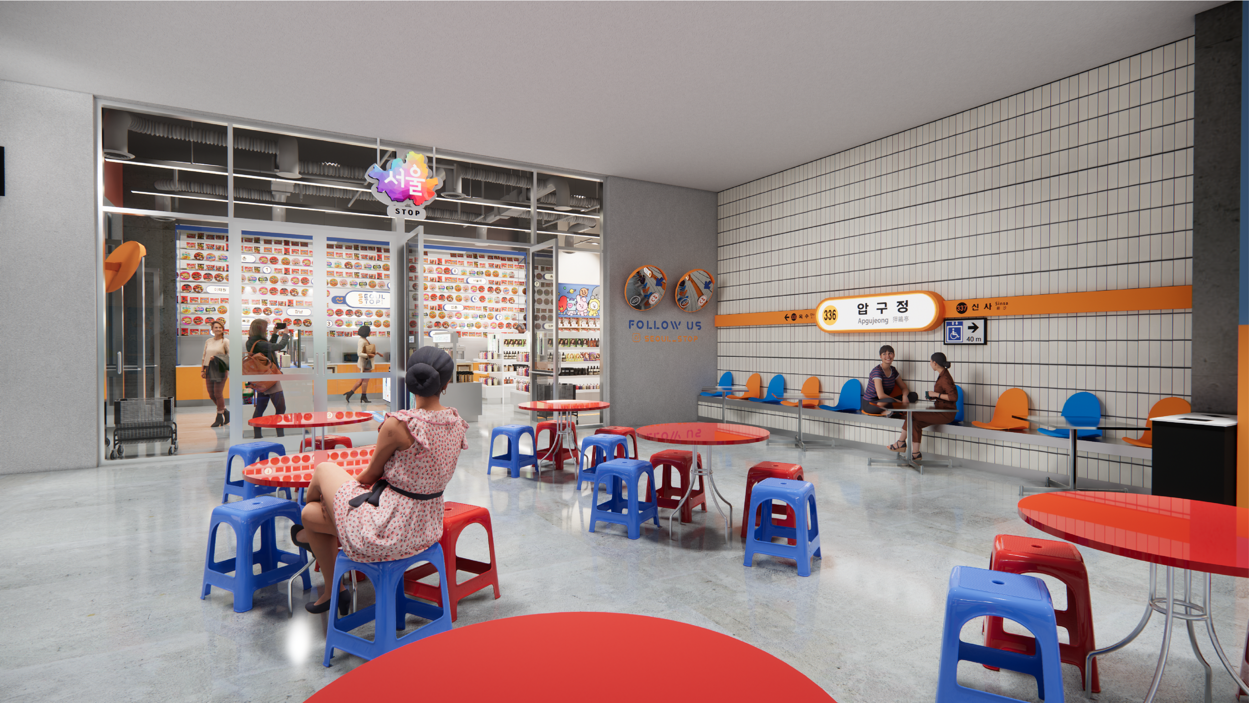
Seoul Stop’s decor does most of the heavy lifting to express its story— immediately upon entering, you’re wrapped in the store’s replica subway, surrounded head to toe with themed imagery. You can take comfort in the clear-cut story told by the décor, full of sights familiar to those who have ventured into a subway network. The store uses signature white subway tiling, corner mirrors, and even a set of faux subway doors to fully capture a snapshot of a “subway convenience store”. Signs dispersed around the store declare “stops”, announce locations, adorn the floors with directional input— everywhere you look, Seoul Stop’s story is clear to see. When all you need is a simple subway’s charm, why muddle your vision with unnecessary details?
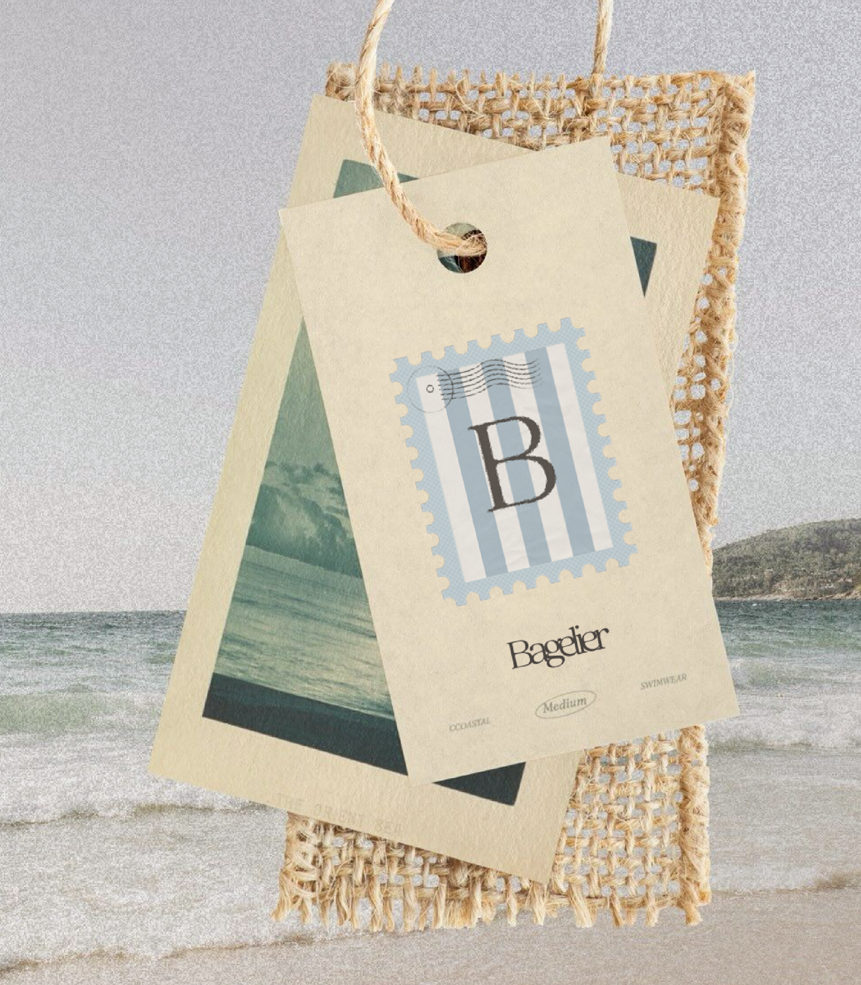
A set of paper tags. The topmost one has the Bagelier monogram.
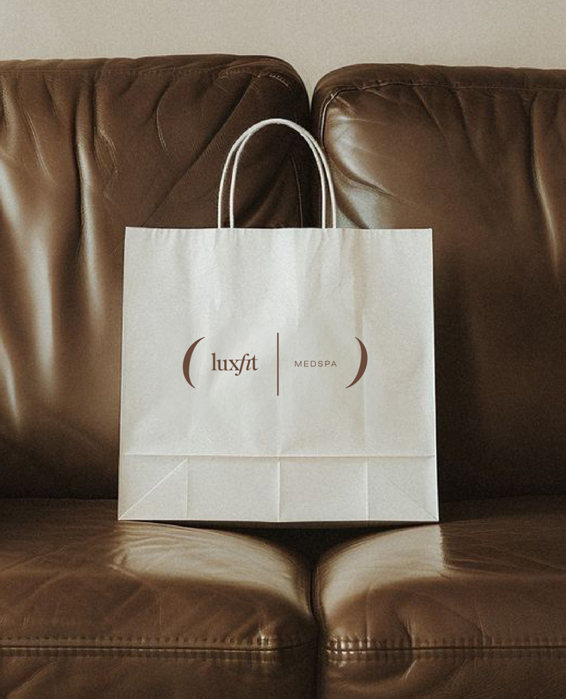
A LuxFit branded shopping bag on a brown leather couch.

Two Seoul Stop business cards layered stylishly over each other.
A bagel enjoyed on the beach, a formula awaiting you for its completion, a subway store full of whimsical details. Just as countless buildings exist out in the world, so do countless stories to tell alongside them— and equally countless ways to express them, as well. No matter the concept, JDEA Studio is committed to helping every space convey their story in the most satisfactory way possible.
